What's new
Recent improvements to how Poster Lab works, from newest to oldest.
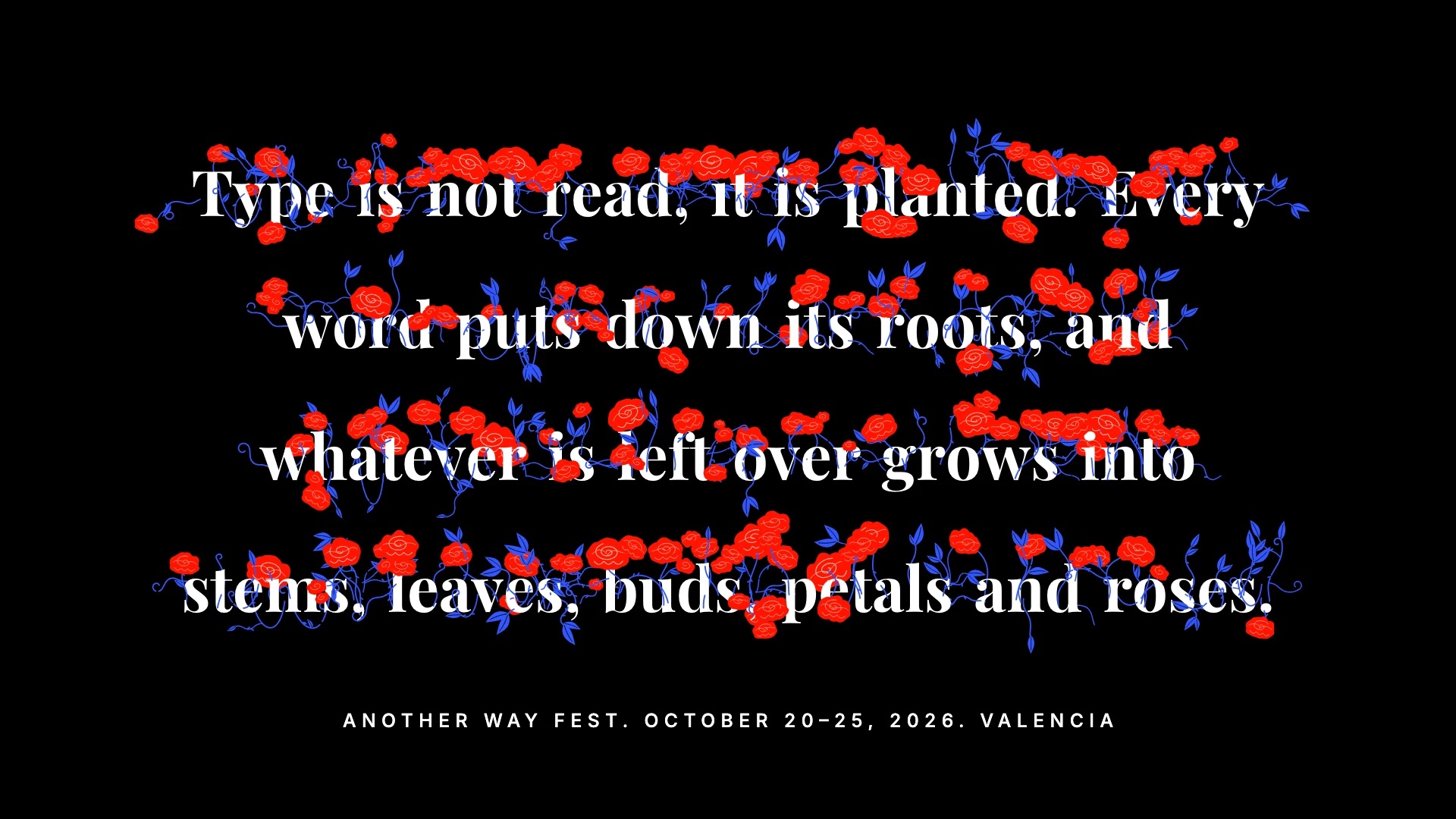
Flowers, a garden of type
A new look where stems, leaves and roses grow out of your letters as you type. A space cuts the word and its last letter blooms, deleting makes the garden wither, and a hand-drawn boil keeps it alive. The Type tab opens with ten palettes and the footer size, set in spaced caps centered under the garden. The Motion tab holds the rest: keep Typing, or pick one of seven loops (Breathe, Grow & wither, Typed, Gust, Reach, Scatter, Visitor) and export it as a seamless video, then tune how the stems recoil and boil. Based on Type Garden by Akshat Agarwal.
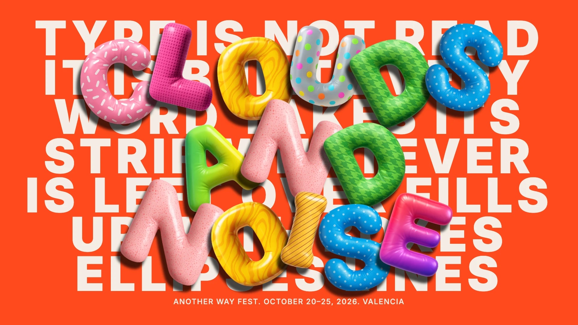
Inflated, balloon type
A fifth look, clean and glossy on purpose. Your text is set big and calm behind, and one highlighted word, like “Clouds and noise.”, is built from inflated balloon letters in front of it, in glossy, patterned colors. Choose between five letter sets (neutral, black, color, fluffy and rainbow), the width of the text behind, and how many words each piece takes, move the light, and press S to walk through your text.
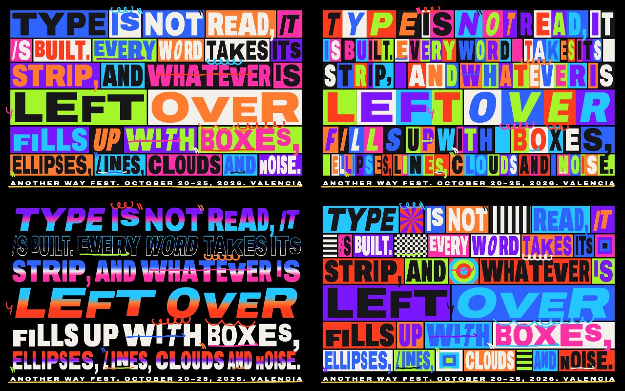
Loud Blocks, a protest-poster look
A fourth look, made for loud type. Every word is stretched to fill its own block of color, letters change width and size as if lettered by hand, and marker strokes scribble on top. It comes in four variants: Blocks, Mosaic with a cell for every letter, Gradient with glowing rows and outlines, and Collage with op-art stripes, rings and wheels between the words.
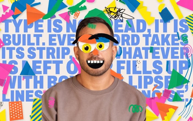
Paper Face, a photo collage look
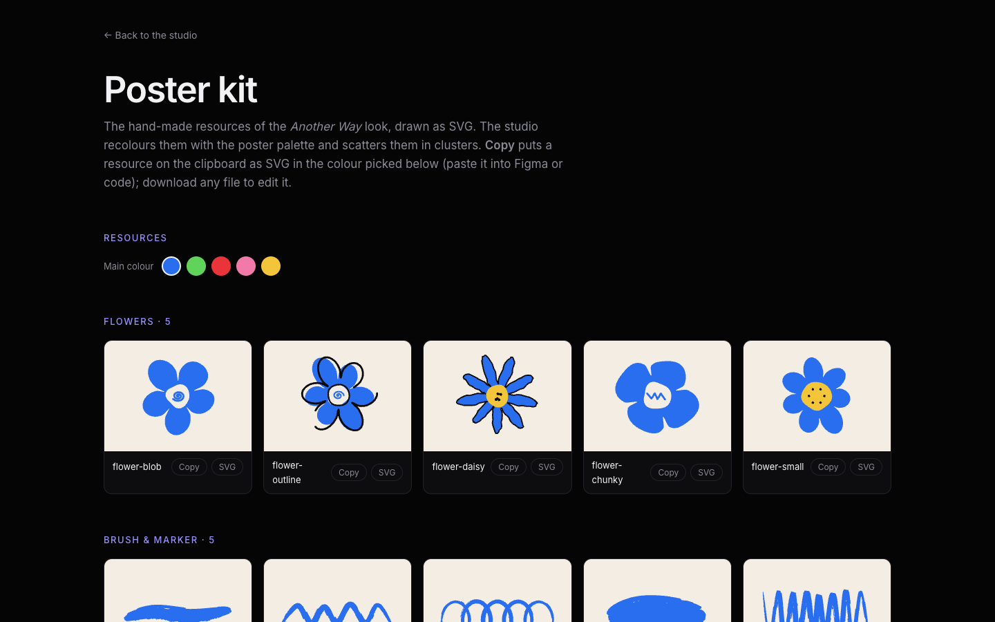
A third variant that starts from your own photo. It finds the eyes and mouth, cuts you out onto cream paper and builds a playful face on top with a mask, googly eyes, brows and a mouth, surrounded by paper scraps and scribbles in one palette. Its resource kit lets you see, recolor and copy every piece.
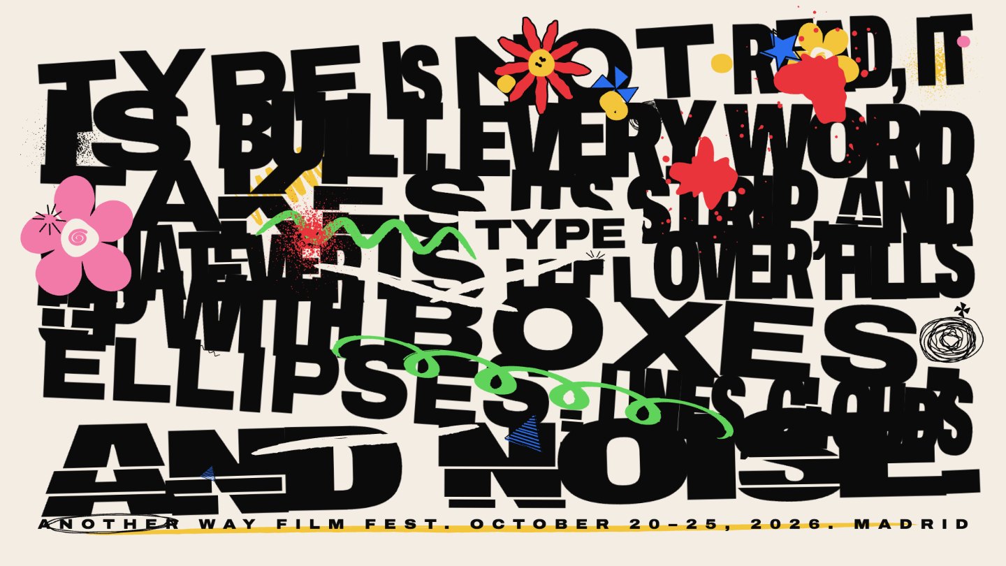
Another Way, a poster look
A second variant built for film-fest style posters. Big Archivo letters mix extra condensed and expanded widths, lean at a slight angle and fill the whole block on a warm cream paper.
Resource kits
Each look now has a "See the resource kit" link that opens a sheet with every shape it uses, so you can see the pieces behind a composition.
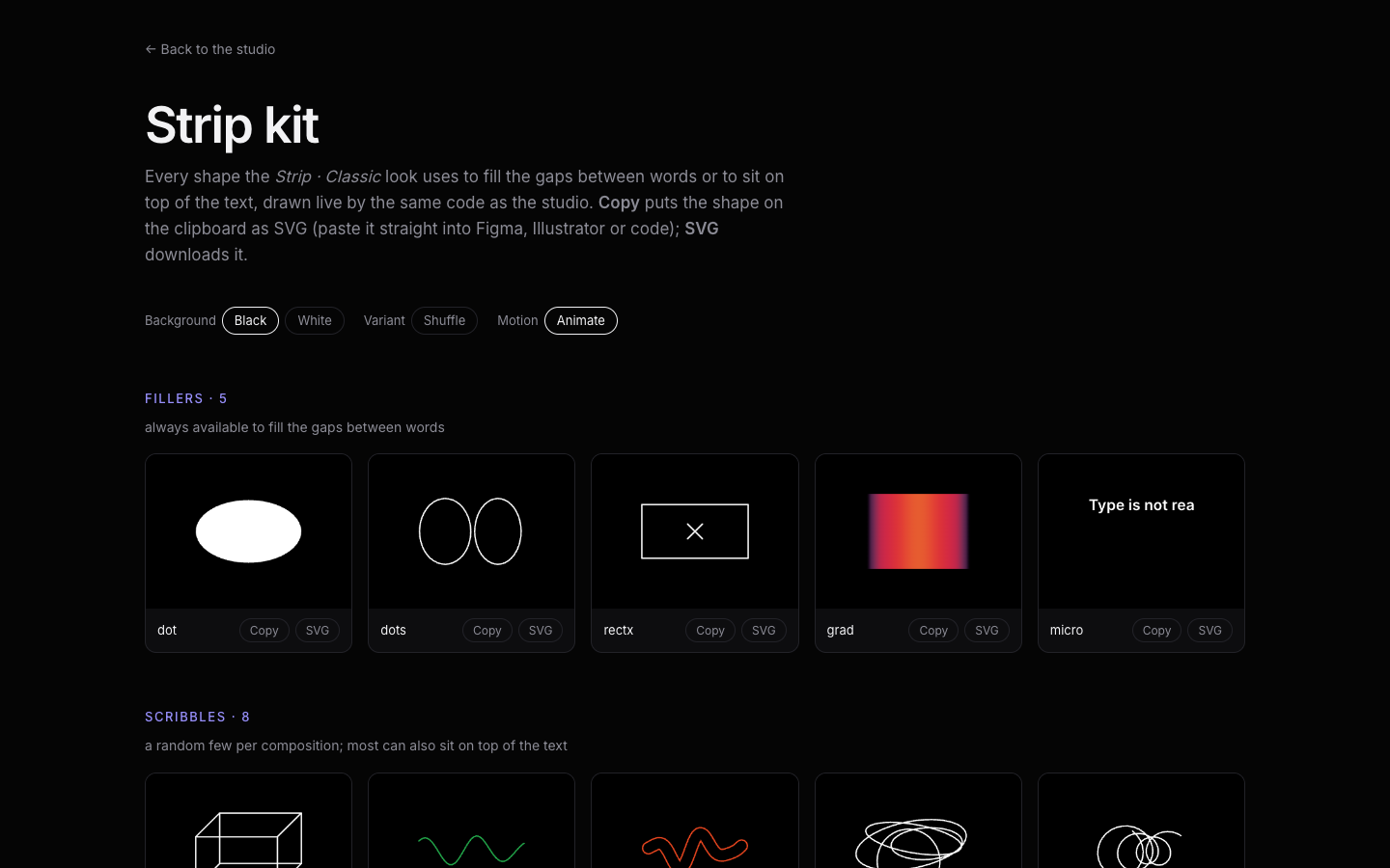
Panels that follow the look
The panel only shows the controls that matter for the look you are in, and labels and slider ranges adapt to its fonts.
Info pages
The info bar now opens its own pages, How I built this and What's new, with the same look as the rest of the platform. Each page links back to the studio.
Made for mobile
We gave the layout some love on small screens. Panels, buttons and the canvas now sit comfortably under your thumb, so you can design from your phone.
Smoother animations
We went back through every animation and refined the timing, so strips glide and settle with a calmer, more natural rhythm.
Preview mode
A new Preview button hides every control and leaves only the canvas, so you can watch a composition in motion. Pause and exit stay one click away.
Light and dark canvas
Your composition now lives on a canvas you can switch between light and dark, so the same colors can feel soft one moment and electric the next.
Worms
A new effect: little worms that wiggle across your letters and add a playful, hand-made touch to any composition.
Inner padding control
You can now adjust the inner padding of your composition without changing the design. The letters keep their shape and rhythm while the space around them opens or tightens, a small control that makes a big difference.
Distortion toggles
Distortions now have their own on and off buttons. Switch stretch, skew, wave and step on to play, or off to bring your letters back to calm, all in a single click.
Italic type
Text can now be set in italic, giving your words a gentle lean and a lot more personality.
Redesigned controls
The interface was reorganized into a clearer panel layout, and the main buttons were updated so the tools you use most are easier to reach.
Built on a shared structure
The studio reuses the same structure as its sister sites: the same layout, panels and export flow. That made it quick to start and keeps every tool in the family consistent.